In today’s digital universe, where information overload is the norm, the power of visualisation shines as a beacon of clarity. Infographics, illustrations, charts, and maps bridge the gap between sets of complex information and its audience. These materials can be of great help to any organisation with a story to tell.
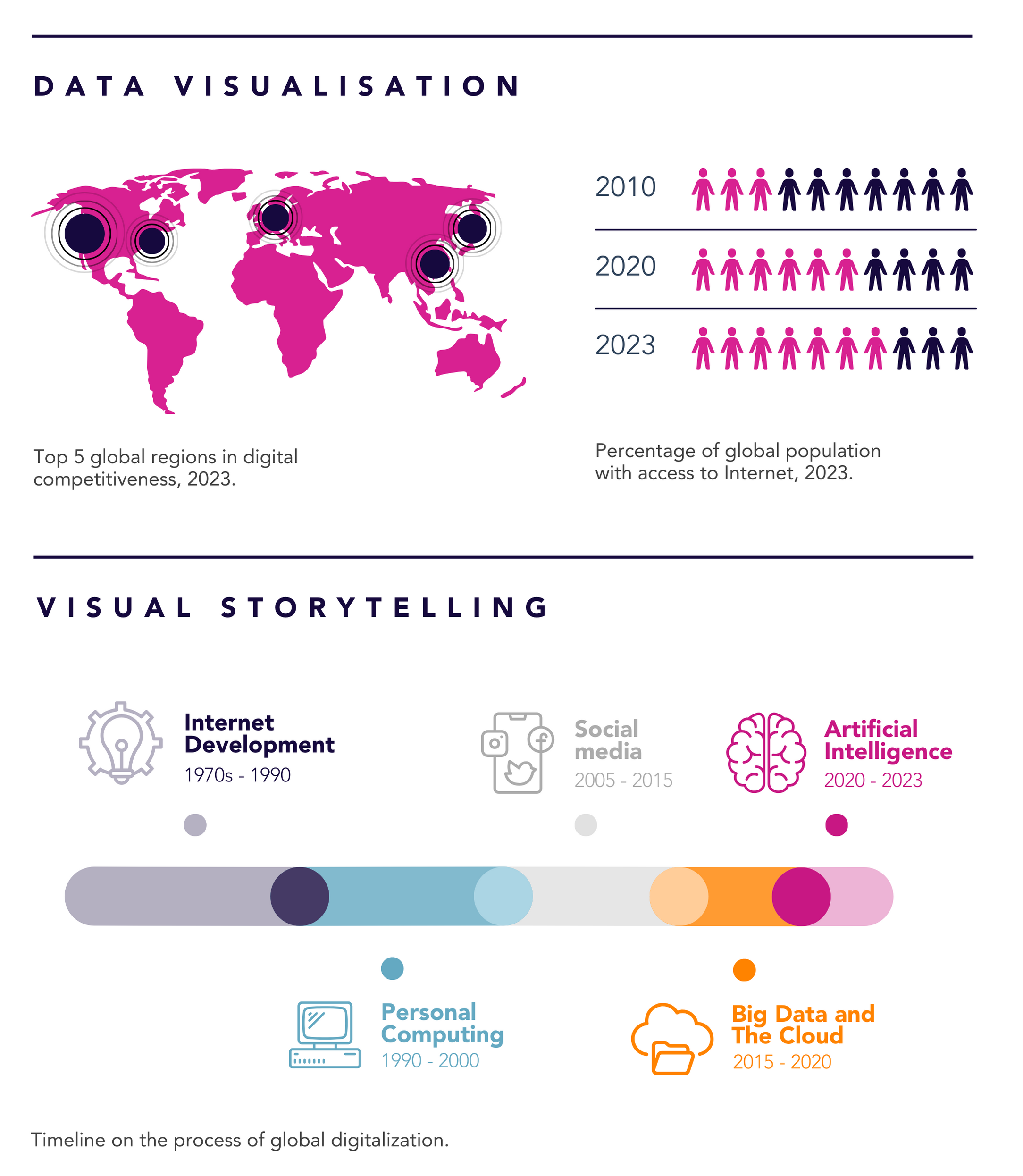
There are two broad concepts that can help us describe two categories of visual materials. The first is data visualisation: the graphic representation of a set of data, very often numerical or quantitative. Charts, graphs, and maps classify the information and showcase the relationship between different units of data. The other is visual storytelling: the use of visual representation to tell a story, taking the reader from point A to point B. Typically composed of qualitative information, brochures, timelines, or sets of illustrations do that function. These do not need to be mutually exclusive: typically, a good infographic can combine both!
So what makes a good infographic? To start with, there are no good visuals without good stories, so relevant data must be your starting point. Then, you can think about the journey you want to take the audience on. Drawing a sketch on a blank paper might help you find a direction. Mastering the art of leaving out information that does not add to your direction and to the point you want to make is also essential. A last tip: create a visual hierarchy. Not everything has the same importance, so avoid writing everything in big, bold letters.
We see the art of infographics at its finest in some digital and traditional media outlets, such as Delayed Gratification – a magazine showcasing stories through elaborate infographics. Illustrations and icons are usually key elements: Just as they make information more concrete, providing images, they enable synthesis. With illustrations, you can choose to display only the essential elements of what is being represented. You can also represent the future, the past or imaginary things that don’t exist in real life. It is also more universal than photography: a drawn person in a setting is not a concrete person, it could be anyone – including the reader.
Want to get started with infographics? The book Visual Thinking. Empowering People and Organisations is full of sketches, simple infographic types and explanations on which one to use depending on the set of information that you have – a linear graphic? A web? A tree? – as well as how to represent the elements that connect the information – do you need an arrow? A call out? A dotted line? You can try user-friendly software like Canva, Piktochart or Infogram to make your first steps… or reach out to us and our creative team!